
While you ponder that, here are mine....
1) How many medals are there to be gained in these categories?
2) Which countries have won the most Gold medals in each of the last 3 years?
3) Is there a country that is always a bridesmaid (ie - always the silver, never the gold)?
4)How do women fare by country? Is there a significant change in the top 3?
5)Which year had the highest number of countries winning medals?
Your first question should now be, "How are you going to find all that out?". And my answer shall be, "With the most effective data analyser Excel has to offer - the pivot table".
I know a lot of people who would prefer to wash (by hand) the USA's Olympic team's training kit, than use a pivot table. Trust me, a basic understanding of pivot tables is all that is needed to make you ditch the sweaty socks, and embrace the beauty of the table. So here it is...a taster course in basic pivot tables.
In brief, a pivot table looks at a big clump of data, and acts like Tom Cruise in Minority Report. You know that scene where he stands in front of the big clear screen and pulls images from left and right onto the screen, to come up the bigger picture? Well, that's what a pivot table does. You select how you want to look at your data, which parts you want summarised, if you want it added / counted / averaged, and you press ok. You'll be rewarded with a better overview of your data. Just try look less tense than Tom Cruise.
That's the important part, to not be tense. Because pivot tables were made to be played with. Don't be scared to break it, you can't really. You'll just change the look of it. You can change it back or start again, it is not going to affect the underlying data.
Speaking of which, here is our data (not all of it, I don't have the space!). I downloaded some stats from www.databaseolympics.com, and manipulated them to come up with this table:
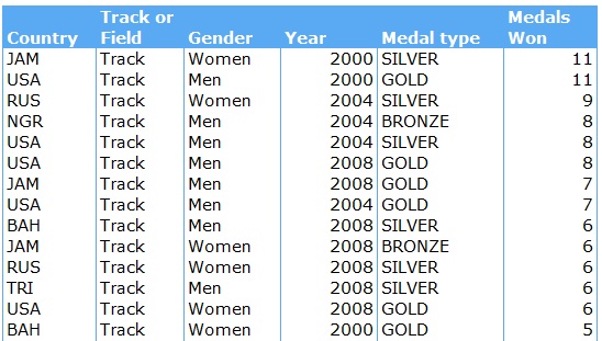
This continues down to row 302, and covers 2008, 2004 and 2000. Something to note - I have a heading over each column. This is essential, otherwise your pivot table is not going to work.
So, to create a basic pivot table, you select your data (including headings) and go to Insert - Pivot Table or press ALT D, P. A dialog box will pop up to take you through creating your pivot table.
- In Step 1, select Microsoft Excel list or database, and PivotTable.
- In Step 2, just confirm you have the right data
- In Step 3, select where you want your pivot table, and click finish.
You will now get a little blank image on your sheet with pivot table written in it, and a Field List box on your right. If this Field List box doesn't appear when you click on the pivot table image, go to PivotTable Tools - Options - Field List, and make sure it's highlighted.
To create a simple summary of medals won by year, event and gender, you need to click and drag the following items in the Field List to the areas below as shown here:

Note that under Values, we have Sum of Medal. If you wanted to change that to count or average or Minimum, we could click on the downward arrow, select Field Value Settings, and select how we wanted to treat the data.
Also, you may want to change the look and design of your table. Go to the PivotTable Tools - Design tab. From here you can change your table layout (Report Layout - I always prefer Tabular), the look of your table (PivotTable Styles - just scroll down the choices until you find one you like) and whether you want sub totals and totals. Excel will automatically add them.
So here is what our pivot table looks like:

That answers our first question - how many medals per category? But how do we see which country has won the most Gold medals, and if there is always a runner up? We act like Tom Cruise...go to the Field List box, and drag and drop to your hearts content to manipulate the table into various formats.
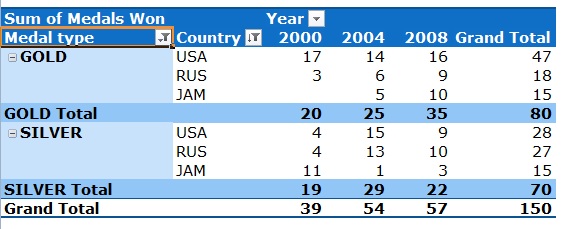
1) Adding the medals and countries as row labels, and years as a column label.
2) I then clicked into the Grand Total column, right clicked, and selected Sort - Sort Largest to Smallest
3) Then I narrowed the field down to the top 3 by right clicking on the Country header, selecting Filter - Top 10, and changed it to the Top 3
4) And I selected only the Gold & Silver Medal types from the drop down box.
To answer question four, we are going to drag Gender into the Report Filter area and remove the Medal item from the field list by just dragging it out. Once you have done that, select Women from the drop down box in the Report Filter:

To answer question five, we actually get rid of the Medals won item completely, and drag the Country item into the Value field. As this is a text field, Excel automatically counts it. Here is the answer:

Now to show you a really cool trick...What happens if you want all the underlying data that comprises the 99 total for 2008? Just double click on the 99, and Excel will create a full table of that data in a new worksheet for you. It will look something like this (again, I haven't included the full table):

This is incredibly handy if you need to zero in on some specific result from your table, and provide the back up data.
As you can see, there are so many ways to use pivot tables, and I have only scratched the surface here. But don't be afraid to give them a bash... they really are fun and so useful once you get the hang of them.
A new tool which Microsoft has added in Excel 2010 is the Slicer, which is brilliant if you want to create an interactive pivot table. I'll be covering this in my newsletter, so if you want to learn more, sign up here.
Enjoy the Olympics!
No comments:
Post a Comment
Like this? Or not? Would you like a specific topic covered? Leave a comment and let me know.....