Man, is this 'summer' holiday dragging on forever? In the height of summer, the bridge outside our house has been flooded twice. The rainfall carries on, the children get more cranky and bored, and parents slowly, but surely, lose their minds.
In a rare moment, I found my sense of humour, and have tried to track the effect of long summer holidays on a parent's patience levels. In continuation of our series on improving your Excel vocabulary, we will look at 2 ways we could calculate this - the easy but long winded way, and the short but slightly more complicated way.
First up though, lets look at some made up figures, formulas and assumptions:
Let me explain my thinking on the figures above:
Variable Factors:
- We have 8 weeks of summer holidays. Cell C3 shows us what week we are in out of those 8 weeks.
- We assume the maximum number of outings/activities a child can attend a week is 14 (2 a day). Cell C4 shows us how many outings the child has actually attended.
Parameters:
- The average assumed cost of an outing is €15.
- The calculation of a child's boredom level is =(C3/C8)*(1-(C4/14)). This is saying the longer the holidays go on, the higher the boredom level will be, and can only be mitigated by more and more outings.
- The weekly cost of outings is simply C7*C4
- The % weekly cost of total possible is C10/210
- The parent's patience levels is calculated as such =1-(((C3/C8)*0.45)+(C9*0.25)+(C11*0.3)). Before you lose your temper trying to figure this out, I have simply given different weightings to the current week in the holiday period, the child's boredom level and the cost of keeping them entertained. Added them all together and inverted.
Method 1: Manual What If Analysis
In this method, you could use the table above and change the variable factors (i.e. Cells C3 & C4) to obtain individual answers for various scenarios. So you could change the week to 6 and the number of outings to 4 and the parent's patience levels would be sliding down to 44%.This is great if you needed to get a once off answer every now and again, but what if you wanted to get the bigger picture? You would use:
Method 2: A What If Data Table
This is the simplest of the What If tools Excel provides. It is a data table that you can either use one or two variables on. We will go straight to using two variables. You need to start by setting up your table like so:
You will need to add in the variables in cells F4 to F17, and G3 to N3. The headings (Weeks in holiday and Weekly outings taken) are optional and should not be included in your range when creating your data table. The formula in F3 is = C12, which is our calculation of our parent's patience level.
Once you have done this, highlight the range F3 - N17 and go to Data - Data Tools - What If Analysis - Data Table. You will get a little pop up box that you need to complete as follows:
Press ok, and your results are displayed as below:
Add in a bit of conditional formatting, using the colour scales, and the problem becomes immediately apparent:
By week 8, a parent is ready to explode...which begs the question as to whose great idea it was to have a 8 week long holiday anyway?
Now, you may be wondering why this is at all helpful to add to your vocabulary. Well, you may not need this exact calculation (unless you belong to the Board of Education, and then please feel free to distribute to the powers that be!). But you may want to calculate the profits to be obtained if you sell a product that has reduced production costs per product the more units that are produced. Or calculate various payment options on mortgages with different interest rates.
My newsletter this week will have some more examples....why not sign up here?
Happy spreadsheeting!
Isn't that just brilliant? I saw that quote on Facebook this week, from LawsofModernWoman. It went straight into first place on my list of favourite quotes, kicking the long-standing favourite off it's perch - "Never use a big word when a diminutive alternative will suffice".
Both of these quotes segue nicely into what I would like to cover today... there are sometimes many different ways to do the same thing in Excel. To have a decent 'vocabulary' of Excel tricks will make your day easier, and will increase your seductive power (to your PC and Excel geeks, at least)! But to remember that the most complicated method is not always the best method, well, that might just take you into hero status.
So here is Part 1 of a series in how to increase your Excel 'vocab' and hopefully teach you a couple of easy to use tricks or shortcuts. The data we will be using is from a list of the 'supposed' best selling books of all time in the UK. Just a detour here - this list is provided by Nielson Bookscan, via the Guardian (click on the link for the full list of the Top 100. I haven't included it here!) I am having serious trouble believing this is the best selling list of all time, so am hoping it applies to maybe the last 10 years. Anyhow, it had good data layout so I used it. Suspend your belief when you look at the results. If nothing else, it will give you ideas for your beach reads....
Tip 1 - Filters are sometimes better than pivot tables.
I know that just 2 weeks ago I was singing the praises of pivot tables in my blog post, but there are times when you just need to have a quick check on something or you don't want to create a completely new table of data. If so, use the filter.
To get the filter onto your data, click somewhere in your table, and go to Data - Sort & Filter - Filter. This will apply the arrows to your header row.
Important point 1 - You can't have blank rows or columns in your table. If you have blank rows, the filter will only apply down to the last row before the blank row. If you have blank columns, the filters won't always go the whole way across. So have a complete, space free table of data before you begin.
Then select which column you want to filter on. In our data below, you may want to check how many of the top 100 books are in the Children's and Young Adult Fiction categories. So you click on the little downward arrow in the Genre column, and get the filter dialog box. At the bottom, all the genres will be selected, so first click on the tick mark next to Select all, to deselect them, and then choose the topics you want to look at:
Press ok, and your table will look like this:
That is 17 out of the Top 100, excluding Annuals and Picture books. How do you know 17 without counting each line? Look at the bottom left hand corner, and it tells you:
Now, what if you wanted to know how many of these 17 books had volume sales of over 1.5 million? You click on the arrow on the Volume Sales column, and select Number Filters - Greater than, and type in 1500000 in the box that appears, like so:
The answer to that is 11, all the Harry Potter and Twilight books. So, you can apply filters to more than one column at a time. Note, too, from the box above, that you can apply more than one filter to the same column. Just select your choices from the drop down boxes.
Important Point 2 - Always be aware of when you have a filter applied. You can easily assess this by looking at the colour of the row numbers. If they are blue, you have a filter applied somewhere. The arrow icon on the column header changes if you have a filter applied so you can easily assess which column is filtered.
To clear a filter, go to Data - Sort & Filter - Clear.
You can also filter by colour. You may have noticed some of the book titles are blue. I have highlighted all the books I have read. To apply this filter, do as shown in the image below:
This is ridiculously handy if you are fond of using colour to highlight cells. Sadly, I appear to choose all my books from best seller lists. Happily, I still have 48 to get through before I exhaust the list.
Anyway, onto to shortcuts:
Shortcut number 1: To put on, or take off, filters in a hurry, press and hold ALT, whilst pressing D F F
Shortcut number 2: To clear all filters that are currently applied, press and hold ALT, whilst pressing D F S
Tip 2 - You don't always need a formula in a cell to calculate something
Don't worry, this is a quick tip. Using our example above, with all the books I have read filtered, how would you calculate the total number of books sold? Or the average sales volume? Without typing in a formula?
Easy - highlight all the values in the Sales Volume column, and look at the bottom right hand corner. You will see this:
That's your answer. Nice and simple, no need for a formula. If you right click on the toolbar next to these numbers, you can select some other options, like minimum and maximum.
Very useful if you're in a hurry and you need to shout an answer to a irate / impatient / cranky boss!
Our newsletter this week will cover how to remove duplicate data using 2 different methods....sign up here.
This was part 1 of 'Improving your Excel vocabulary.' Part 2 will follow next week. Have a good one!
Happy spreadsheeting!
What? What do I mean, Excel is not all about numbers? Surely it is the most formidable number crunching tool available? Well, that's debatable, but Excel does more than crunch numbers. It plays with words, and I thought I would share some of my favourite word / text formulae with you.
Before I start, I just want to point out that although these formulae may manipulate text in Excel, you can also use some of them in number formulae, date formulae etc. I'll give you some examples of how, but these little gems can make your life much easier, so take heed.
As we are now in the thick of the 2012 games, I thought I would use some of our data from last week. USA, while I write this blog, has the highest number of medals, so we'll look at their 2008 stats:
Now, imagine you had some inanely boring job where you had to type out how many medals each country had won, by medal type, using this data table. You could type out each sentence or you could use a formula to create the sentences as shown below:
All this formula does is combine text (which is typed in between the quotation marks and highlighted in blue) and the data from various cells (highlighted in red). To combine it all together, we use the & symbol between each different element of the sentence. So in this formula we use the year, the number of total medals and the medal type, and throw some text into the mix to make it sound sensible.
You could also use the concatenate function to do this, but I prefer to just use the &. It makes for shorter, and easier to follow, formulae.
If you're pedantic, like me, and you don't like the fact that the medal type is all upper case, use the PROPER function, as highlighted in red below:
The PROPER function changes text to the Proper format, so each new word starts with a capital letter, followed by lower case. If you want all lower case, use the LOWER function, all upper case, you guessed it, use the UPPER function.
Another handy formula to know for text data is the LEN function. This will tell you the number of characters in a cell. So if the Gold Medal sentence above is in cell A1, the formula =LEN(A1) would give you an answer of 34. Note that spaces are included in the character count.
But my absolute favourite 3 text formulae can be used on one single cell. Imagine Cell A1 contains GOLD 16 USA. You need to split this up between Medal Type, Medal number, and Country. You can do this using the 3 formulae shown below:
These formulae are pretty straight forward. The LEFT function above says, "go to A1, and bring back the first 4 characters". The RIGHT function says, "go to A1, and bring back the first 3 characters, starting from the end and working backwards." The MID function says, "Go to A1, go to the 6th character, and bring back 2 characters".
Now obviously, these aren't ideal to use if your data is constantly changing length, but if you have constant data, these are brilliant. Or, when used in combination with pretty much any other formula, they are more powerful than Michael Phelps himself.
Now for some fun stuff....
A client received a file from a third party in a excel file which had been formatted from a csv file. This file contained product codes, some of which are, for example, 02-10. Now, open any Excel spreadsheet and type this code in. What do you get? Yes, Excel immediately thinks you're typing in a date, and shows you 02-Oct. So you change your number to Text, and Excel kindly gives you the serial number of the date 02-Oct, which is 41184. By which stage you have completely lost your original product code.
I thought, I pondered, I googled, and I couldn't find a quick and easy way to solve this ( if you do know a quick way to solve this, please share as a comment below!). So I came up with the formula below, which gives us the correct answer of 02-10:
I have colour-coded this formula to try simplify it. Starting with the DAY formula, this takes cell A2, and brings back the day from the full date, ie - the 2nd or 2. Using the TEXT formula, I have said take the answer, and format it as a two digit number ("00"), giving us 02.
I did the same with the MONTH formula, which brings back the number month, or 10 in this example. Again, I have set the format to a two digit number. I then inserted a dash into the middle, and hey ho, we have a code 02-10.
This is just one example of how you can combine non-numeric formulas with numeric or date formulae. The possibilities are endless, don't be afraid to experiment with formulae, just keep track of your logic as you go.
In our newsletter this week, we'll look at some more text functions...sign up here.
Have a great week!
Off the top of your head, right now, what are the top 5 burning questions you have on Track & Field performance in the last 3 Olympic summer games?
While you ponder that, here are mine....
1) How many medals are there to be gained in these categories?
2) Which countries have won the most Gold medals in each of the last 3 years?
3) Is there a country that is always a bridesmaid (ie - always the silver, never the gold)?
4)How do women fare by country? Is there a significant change in the top 3?
5)Which year had the highest number of countries winning medals?
Your first question should now be, "How are you going to find all that out?". And my answer shall be, "With the most effective data analyser Excel has to offer - the pivot table".
I know a lot of people who would prefer to wash (by hand) the USA's Olympic team's training kit, than use a pivot table. Trust me, a basic understanding of pivot tables is all that is needed to make you ditch the sweaty socks, and embrace the beauty of the table. So here it is...a taster course in basic pivot tables.
In brief, a pivot table looks at a big clump of data, and acts like Tom Cruise in Minority Report. You know that scene where he stands in front of the big clear screen and pulls images from left and right onto the screen, to come up the bigger picture? Well, that's what a pivot table does. You select how you want to look at your data, which parts you want summarised, if you want it added / counted / averaged, and you press ok. You'll be rewarded with a better overview of your data. Just try look less tense than Tom Cruise.
That's the important part, to not be tense. Because pivot tables were made to be played with. Don't be scared to break it, you can't really. You'll just change the look of it. You can change it back or start again, it is not going to affect the underlying data.
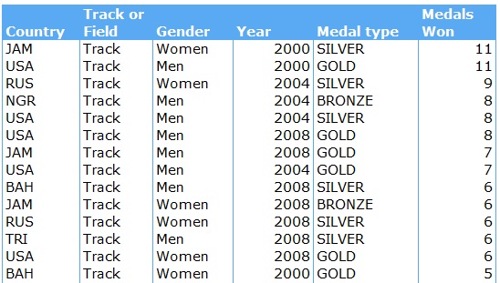
Speaking of which, here is our data (not all of it, I don't have the space!). I downloaded some stats from www.databaseolympics.com, and manipulated them to come up with this table:
This continues down to row 302, and covers 2008, 2004 and 2000. Something to note - I have a heading over each column. This is essential, otherwise your pivot table is not going to work.
So, to create a basic pivot table, you select your data (including headings) and go to Insert - Pivot Table or press ALT D, P. A dialog box will pop up to take you through creating your pivot table.
- In Step 1, select Microsoft Excel list or database, and PivotTable.
- In Step 2, just confirm you have the right data
- In Step 3, select where you want your pivot table, and click finish.
You will now get a little blank image on your sheet with pivot table written in it, and a Field List box on your right. If this Field List box doesn't appear when you click on the pivot table image, go to PivotTable Tools - Options - Field List, and make sure it's highlighted.
To create a simple summary of medals won by year, event and gender, you need to click and drag the following items in the Field List to the areas below as shown here:
Note that under Values, we have Sum of Medal. If you wanted to change that to count or average or Minimum, we could click on the downward arrow, select Field Value Settings, and select how we wanted to treat the data.
Also, you may want to change the look and design of your table. Go to the PivotTable Tools - Design tab. From here you can change your table layout (Report Layout - I always prefer Tabular), the look of your table (PivotTable Styles - just scroll down the choices until you find one you like) and whether you want sub totals and totals. Excel will automatically add them.
So here is what our pivot table looks like:
That answers our first question - how many medals per category? But how do we see which country has won the most Gold medals, and if there is always a runner up? We act like Tom Cruise...go to the Field List box, and drag and drop to your hearts content to manipulate the table into various formats.
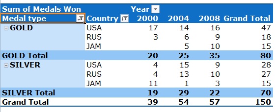
Here is our answer for questions 2 and 3. After the USA, Russia is always chasing those Gold medals. I created this table by:
1) Adding the medals and countries as row labels, and years as a column label.
2) I then clicked into the Grand Total column, right clicked, and selected Sort - Sort Largest to Smallest
3) Then I narrowed the field down to the top 3 by right clicking on the Country header, selecting Filter - Top 10, and changed it to the Top 3
4) And I selected only the Gold & Silver Medal types from the drop down box.
To answer question four, we are going to drag Gender into the Report Filter area and remove the Medal item from the field list by just dragging it out. Once you have done that, select Women from the drop down box in the Report Filter:
And look at that...Russia has taken the lead.
To answer question five, we actually get rid of the Medals won item completely, and drag the Country item into the Value field. As this is a text field, Excel automatically counts it. Here is the answer:
Now to show you a really cool trick...What happens if you want all the underlying data that comprises the 99 total for 2008? Just double click on the 99, and Excel will create a full table of that data in a new worksheet for you. It will look something like this (again, I haven't included the full table):
This is incredibly handy if you need to zero in on some specific result from your table, and provide the back up data.
As you can see, there are so many ways to use pivot tables, and I have only scratched the surface here. But don't be afraid to give them a bash... they really are fun and so useful once you get the hang of them.
A new tool which Microsoft has added in Excel 2010 is the Slicer, which is brilliant if you want to create an interactive pivot table. I'll be covering this in my newsletter, so if you want to learn more, sign up here.
Enjoy the Olympics!
I have been trying my very hardest to ignore the fact that it is July. Because I live in Ireland. And I used to live in South Africa. And I am pretty darn sure that their winter is probably a little bit warmer than our summer this year. Now don't get me wrong, Ireland has a lot of good things going for it. Lovely people. Lovely beaches. Lovely scenery. Just not so lovely bbq weather.
So I was wondering today whether I am being a bit thick-skulled. I mean, I have lived here for nigh on eight years. I should be used to the non-event that is summer. My husband talks fondly of his hot childhood summers in Cork. Even I remember a couple of good weeks of sunshine when I first moved here. So am I just being silly, wanting a few days of sun?
I don't like thinking I may be losing my mind, so I decided to do what all good analysts should. I graphed the data. This data is all from www.met.ie. So, from 2000 to 2012, the total rainfall and mean temperatures recorded in June at Cork Airport have been:
If we start by just doing a simple bar graph of the temperatures, it looks like this:
I have added a trendline, and just look at that. Things are definitely slipping. To add a trendline, double click on one of the bars to select your series, right click and select Add Trendline. You can change the look of the line through the options in the dialog box that pops up.
Now, we add in the rainfall, just for the laugh. If we maintain the graph as is, it will look like this:
Not so helpful. What we need to do is plot the rainfall on the secondary vertical axis. You need to follow a couple of steps to do this:
1) Select the rainfall series by either double clicking on one of the bars, or going to your Chart Tools tab on your menu ribbon and going to Format. At the top left hand side you will see a drop down box. Select the Rainfall series, like so:
2) Once the series is highlighted, right click and select Change Series Chart Type. Select a basic line graph.
3) Right click again and select Format Data Series. The following Dialog box will pop up:
Under Series Options, click on the Secondary Axis and you're sorted. Add another trendline for the rainfall, make your lines pretty, and your graph will look like this spectacular specimen below:
Thankfully, this graph proved I wasn't completely losing my mind. Temperatures are going down and rainfall is going up. Not a good recipe for planning bbq parties.
However, I would be a very bad analyst if I didn't point out that the ridiculous amount of rainfall in June 2012 is definitely skewing the trendline. So I re-did the graph up to 2011:
Looks kinda different, doesn't it? Rainfall is still on the way up, but the downward trend on temperature needed another year of low temperature to materialise. No wonder I expected a little bit of heat this year.
Now, unless you work at Met Eireann, these graphs may seem a bit useless. But using the secondary axis is one of my favourite ways of comparing sets of data that have very different number ranges. You can even use percentages. It sometimes really brings home the point you are trying to make with data, when you show not one, but two trends, telling the same story.
This week my newsletter is going to cover something completely different and a little bit fun...how to format your cell comments to make them a little bit more exciting than the drab yellow box. Change the shape, add in pictures. Interested? Sign up here.
Hope you have some sunshine in your spreadsheets this week!
Close your eyes and imagine you're a multi-millionaire. Think of all those houses, holiday homes, cars, private jets.... When I do this, I just think that it must be an absolute nightmare to keep track of the asset values. (Ok, I may fantasise about a beach house in the Maldives...but I'd still worry about keeping my asset values under control!)
Back to your daydreams....now picture that your beloved wife blindsides you with a surprise divorce (who could I be referring to ?). Besides maybe needing a good friend on speed dial, you would also need to have those asset values to hand, and pretty darn quick. Imagine, too, that you don't mind having a large staff, and you don't want any one of your accountants having access to too many of your assets. To provide adequate segregation, you have an accountant deal with each of your asset groups, and each of them report to you directly with a summary of assets, values, and the current month's running cost.
* Note - this is a simple illustration, so these figures are completely and utterly fictional, as I have eschewed buying luxury houses or cars in lieu of a simple life. Also, I would assume any multi-millionaire worth his salt would want to know a whole lot more about his assets, but we're keeping this simple....
So how can I help speed up this little part of your working life? Well, imagine each asset accountant has a template which he updates each month:
You, sitting in your plush office, add these figures every month to an asset overview sheet you use to keep track of your investments. This admittedly wouldn't take long but, to make it even easier, you could link your workbooks so that when your accountants update their templates each month, yours would automatically update too.
So, how do we link workbooks? Easy really. There are 3 ways to choose from, which I will take you through below, but what you want is for your summary to have formulae that look like this:
All this formula is saying is, instead of looking for the total on the summary sheet, go to a different workbook (City Apartments.xlsx) and in that workbook, look for a sheet called "City Apartments", and then find cell C10 on that sheet and bring its contents back to the summary sheet.
The official syntax is [WorkbookName]SheetName!CellAddress
So, how do get the Linking Formula into your workbook?
1) You can type it in.
This may be an easier option if you don't have the other file open, but some things to note on typing in a file name:
a) 100% accuracy is required otherwise it won't work;
b) If the file is closed, you will need to type in the full address, which may look something like this; ='C\Data\Assets\Monthly Updates\[City Apartments.xlsx]City Apartments'!$C$10 . Not so easy to get 100% right (see point a);
c) If your workbook or worksheet has spaces, it will need the little ' at the beginning and end of the name.
2) You can point and click
This really is as easy as it sounds. Firstly, open your Summary Sheet and City Apartments sheet. In the Summary Sheet, click on Cell C4 and press =. Then go to your City Apartments sheet and click on cell C10. Press enter and your formula is there, perfectly spelt and looking impressive.
You can use this for all sorts of formulae that require an external link, not just picking up a number. You just type your formula and when you need the external data, just include the external cell references as I described above.
This, in my mind, is the best and easiest way of setting up links. It allows you the most flexibility, and is always accurate.
3) You can paste a link
If you simply wanted to transfer data from one cell into your workbook, as we did in our example, you can just paste as a link. So, using our example, to transfer the total value from the Cars workbook, you would click on cell C11 in the Cars workbook and copy it. Then go to cell C6 in the summary sheet, and Paste Special - Paste Link (Or Home - Clipboard - Paste - Paste Link). This creates the same linked formula you would get by pointing and clicking.
With points 2 and 3, when you close the external workbook, the full name is then shown in your formula.
With all of the above steps, if the external file is updated, when you open the summary file, the data will update automatically.
Also note that in Excel 2010, new security feautures have been added. So the first time you re-open your Summary sheet, you will see a ribbon appearing at the top of your page asking whether you want to enable links. Click Yes, and Excel shouldn't ask you again.
Now, I hate to bring you back down to earth, but time to stop imagining you're a multi-millionaire, and start assessing whether there are any workbooks you can link, and therefore save you time.
Our newsletter this week will provide some more tips on link, and some troubleshooting hints. If you haven't already, why not sign up here?
Happy Spreadsheeting!
A PS here (thanks to reader Martin for pointing out that I forgot to mention this) - if you change the source file (ie - insert or delete rows or columns) , when your final file is closed, the final file will not be adjusted, and will pick up the wrong data. So either always have both files open when making adjustments, or use a vlookup to pick up your data.
Well, the 4th of July 2012 was significant. Not only did the United States' celebrate their 235th day of Independance, but the good scientists in CERN announced that they are pretty much certain they have discovered the Higgs Boson. The "what?", you may splutter into your coffee. I am certainly no expert in particle physics, so here is an easy explanation. In short, it is the tiny little particle that gives everything mass.
This led me to think about my own body mass (not something I like contemplating for very long!), and the fact that I hate having to go online to use a BMI calculator, when it would be really easy to create my own, and track my progress. Which then led me to thinking about Macros. And how they can make life easy. And how they can also make life very very frustrating.
So I am going to show you how to record a VERY simple macro. This one is really very simple. But it will give you an idea of whether there is anything you could speed up if you just recorded a simple little macro to save you from doing repetitive and boring tasks.
However, it comes with a warning. It is my experience that if you want to play around with Macros, and experiment with improving your work life, you want to have someone close by who knows quite a bit about Macros. Because they are finicky little blighters, and they can come up with errors that are as elusive as the Higgs Boson itself. That said, don't let me put you off, because they can save time.
Another thing to note is that you can of course write Macros in VBA from scratch. You don't need to record them at all. Its just easier, when you are starting out, to record them.
So, the first step in recording a good Macro is planning. Make sure you have everything you need set up before you press record. So I have created a (very fictitious) set of numbers for our test subject, Fred. Fred is 1.85 metres tall and got a lecture in December from his doctor for having a BMI of 36.52, which is classified as clinically obese. Fred's New Year's resolution was to get his BMI down to 28 by the end of that year. Looking at our data, you can see he is doing well so far:
So it is now June, and Fred has dropped down to a BMI of 33.02. The Macro we are going to record is simply going to copy the BMI each month when he recalculates it, and add it to the graph data, to update the graph. Like I said, really simple. You may want to try replicate this to see if you can get the Macro to work. If you want to, the formula for the BMI is: =C6/(C5*C5)
I have the graph data set up on the same sheet, like this:
So we are nearly ready. We just need to insert Fred's weight for July into cell C6. Lets say he is now weighing 110kgs, which gives him a BMI of 32.14.
Now, lets record. I'll show you how to start recording, and then talk you through each step. So go to the Developer tab on your menu ribbon, and click on Record Macro. You will get a box like this:
Choose a name for your Macro, but note that it won't accept spaces in names. You can also assign a shortcut key of your choice. I also use the letter in capitals as it is less likely to already be assigned a shortcut role.
If your Macro is specific to a particular workbook, then choose the option shown above. However, if it is something you would like to use in all your spreadsheets, store it in Personal Macro Workbooks, and it will be available whenever you open Excel.
Also note that Macro needs to be saved in a Macro Enabled Workbook, so make sure that is what your workbook is saved as.
Click Ok and remember that everything you do now is recorded. You will get a little square in the bottom left hand corner of your workbook which you need to press to stop recording the macro.
Then you just do the following:
Click on Cell E6, and press Ctrl C to copy
Click on Cell N3, and press Ctrl + down arrow (this should take you to June's BMI figure)
Click on the down arrow once more (to take you to July's space) and Paste Special - Values
Press Esc
Press Ctrl S to save.
Click on the little square at the bottom left hand side of your spreadsheet, or go to Developer, Stop recording, and you're done. Your table data is updated, your graph is updated. Life is good.
This looks easy, no? Well, hate to break it to you, but there is already an issue with this macro. If you go to your developer tab, click on Macro, select your Macro and click the Edit button, this screen will appear:
This is your VBA code. Cool, isn't it? See that line I have highlighted? That's the problem. Because when you select Cell N3, and then press Ctrl + Down Arrow, it takes you to the last cell with data in it. You then press down once more, and the Macro recording selects the absolute cell reference of N10. Which is fine for July, but in August, when you run the Macro, you will find it saves the BMI into the July cell. How do we fix this?
We change the code to say "Go to N3, then go to the last cell with data in it, then go one row down." How? Easy - instead of having the code as highlighted above, you replace that one line with :
ActiveCell.Offset(1,0).Select
This will ensure you always paste in the next empty cell in column N. The offset function is great for Relative referencing, as you can move around by choosing how many rows and columns to move by, instead of selecting a specific cell.
Whenever you make changes to your code, always remember to press the 'Reset' button. Its the little square highlighted below:
Then you can close out your VBA screen and you should be ready to run your Macro. How do you do this? Either by pressing Ctrl + whichever shortcut key you selected, or go to Developer-Macro-Run Macro. Your Macro will now add in the new data every month, and the graph will update automatically.
Another way to do this is to assign a button to a Macro. My newsletter this week will describe how to do this. Not subscribed yet? Do so now, here.
If you want to play around with Macros in your own time, I can recommend purchasing a textbook to help you through the minefield.My favourite author on all Excel related matters is John Walkenbach, but there are loads out there.
Enjoy, and hope I haven't scared you off Macros for life. They are great little timesavers, once you get over the set up!
Happy Spreadsheeting!


